

25 March 2020 (updated: 31 March 2022) by Michał Mazur Michał Mazur
A brief story on how our team approached a conceptual UX and UI redesign project for HBO’s primary VOD service.
HBO Max is an upcoming video on demand streaming service, set to release in the spring of 2020. Based on the two available HBO services released prior to Max, we decided to create a visually stunning concept design of our own, backed by user research and usability tests.
The whole process took us less than 3 working weeks of 2 people.
Crafting the HBO VOD design process
Our creative process was constructed around the idea that the final design should not only represent a strong and visually stunning brand image, but primarily increase the usability and immersiveness of prior HBO ventures in the VoD space.
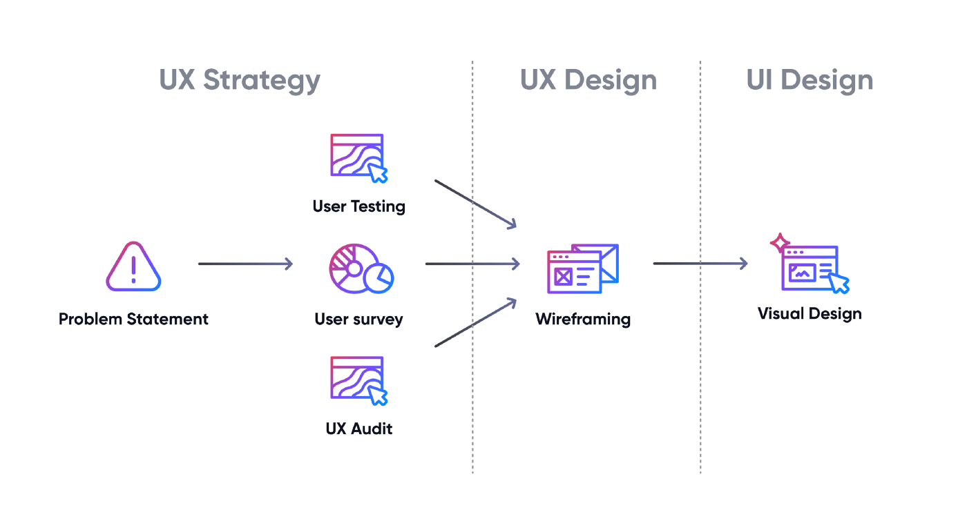 Our process was divided into 3 stages — UX Strategy, UX Design and UI Design
The problem statement
As many of our colleagues were HBO GO users, we heard many comments about the user experience problems with the platform. The team behind the project set out to define a problem statement that we would later explore with user research and address during the design phases:
Improve the usability and immersiveness of HBO’s browser-based streaming service by addressing problems with search, browsing and content personalization.
Exploring the needs
Our research was prepared with previously determined problem statements in mind. We wanted to look into those issues further to evaluate their complexity and get closer to our desired goal of improved user experience.
Bear in mind that our project was purely design-orientated, so we intentionally decided not to get in-depth with technical problems which could not be solved by design work.
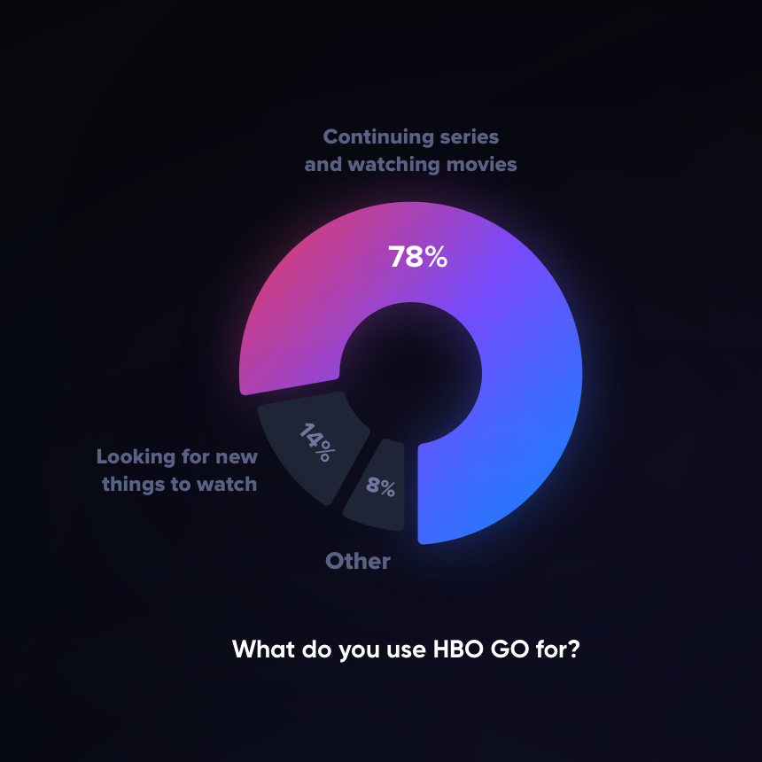 78% of users use HBO GO to continue watching series and movies, 14% for looking for new things and 8% for other purposes.
Running a good ol’ survey
We gathered tons of responses in a Google Forms survey we sent out to HBO GO users.
The survey helped us identify the users’ usage patterns and gather insights into the problems that surface in the platform’s day-to-day use.
The right mix of qualitative and quantitative data fed into an in-depth exploration of the problem statement we had set.
Our main observations were:
- Half of the respondents use HBO GO every day.
- Most of the usage is not content exploration, it’s continuing where you left off.
- 52% do not use the My List function. Some because it’s hard to use, some, because they didn’t know it exists.
- Users mostly depend on their memory to remember what to watch next or to remember whether the “Continue watching” feature is in fact showing them the correct episode.
- Most respondents don’t use or didn’t really notice the rating function.
Pinpointing usability issues
Usage patterns and overall comments are not enough when redesigning an interface so limited in scope (the whole app is in fact less than 10 screens).
We needed to get into the nitty-gritty of the particular features’ usability.
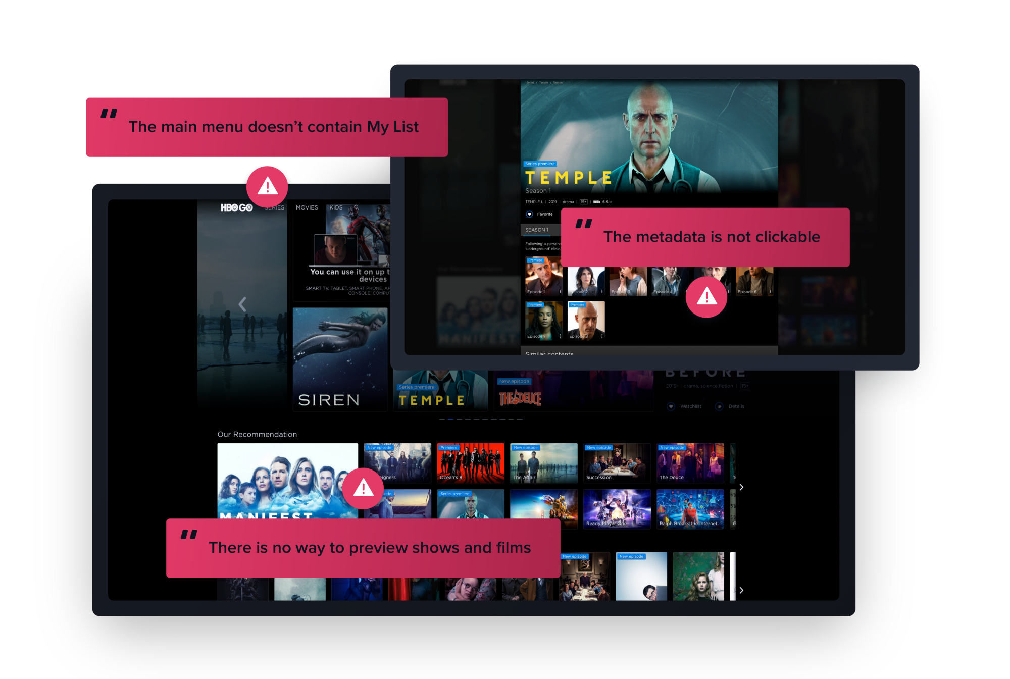 We found over 50 usability issues in HBO GO web application.
Usability testing
Asking our test group to perform specific tasks on the existing HBO GO site allowed us to have an insight into how the users normally operate. Those tests let us observe pain points in real-time and confirm the validity of our initial problem statements.

We typically use Lookback to facilitate our testing (both face-to-face and remote) and it did the job really well. One researcher was able to conduct the tests while the other was noting down the key observations; everything in real-time!
Among the tasks we gave to our participants were:
- Saving a series to a watch later (we were careful not to call it “My List”, to avoid bias)
- Finding out more information about a movie
- Browsing for a specific type of content
- Continuing watching the next episode in a series
 The fact that all of the tiles looked exactly the same was also not helpful in finding your way around the interface.
Thanks to usability testing we were able to see first-hand that users find it hard to browse content without the possibility to filter and sort.
Any content saved for later was surprisingly difficult to find in the interface, which immediately made the “My List” feature our core interest.
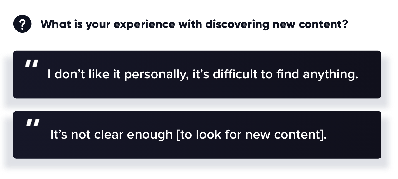
Many users didn’t use the search functionality at all, which corresponded to what we learned in the Google Form survey.
One of the biggest lessons that influenced our design was differentiating the use cases between watching series and watching movies.
I have a completely different mindset when I want to watch an episode of a TV show: I want something shorter, and something that I know, so I know what to expect. Watching a movie is a whole different operation — carving out at least 2 hours of my time makes it worth to prepare or buy some snacks and drinks
A user during our usability testing session
UX audit
User testing typically helps find most of the core problems in the app. However, we wanted to go even deeper with the analysis, so we conducted a UX audit to supplement it.
Audits help find high-level problems, as well as tiny details that really make a difference when you use the interface every day.
Here are a couple of problems we wanted to avoid when redesigning the interface:
- The browser back button behaviour was inconsistent across the website.
- There was no way to preview what the film or series is about — the user would be forced to go to YouTube to find trailers.
- The breadcrumb navigation did not help the user, as it did not include category levels (“Movies > Interstellar” instead of “Movies > Sci-Fi > Interstellar”)
- Metadata that’s not interactive and does not support browsing by: tag, actor, director etc.
… and 37 more problems. After the audit we created 3 lists:
- Things we want to improve.
- Features that will add value to the user experience.
- Problems we need to avoid.
UX Design
Doing the research was the first step towards finding usability-centric solutions. Here are a couple of specific problems we addressed during the UX Design phase, which were polished in multiple rounds of expert feedback and guerilla user testing.
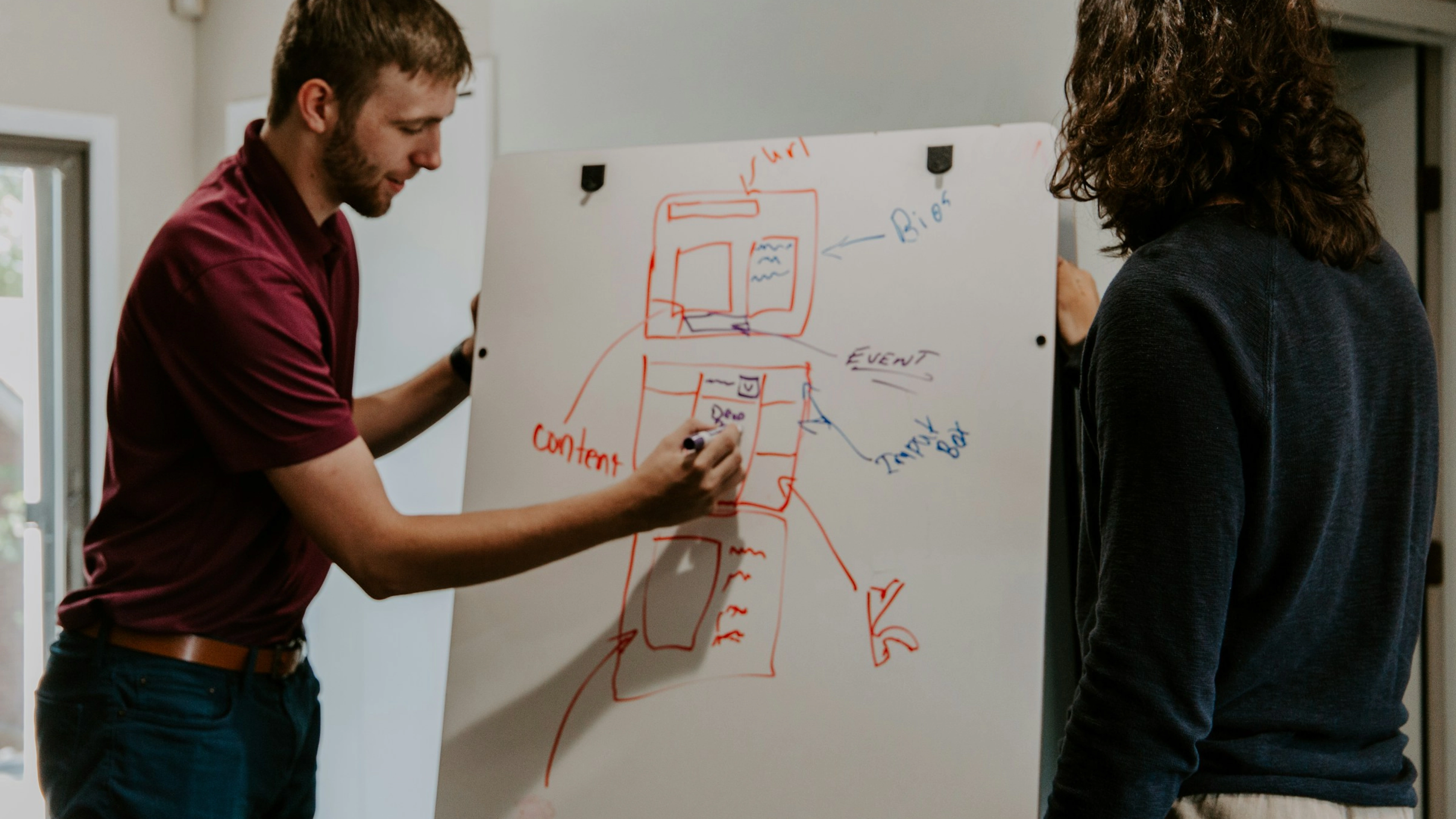
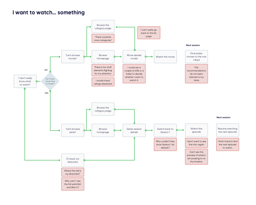 Before working on the wireframes, we needed to get the flow right.
The next step in our design process was to create low fidelity wireframes. They allowed us to see how our research-based solutions work in a basic visual form.
But let’s dive deeper into how we addressed the core problems.
Finding a way to continue watching
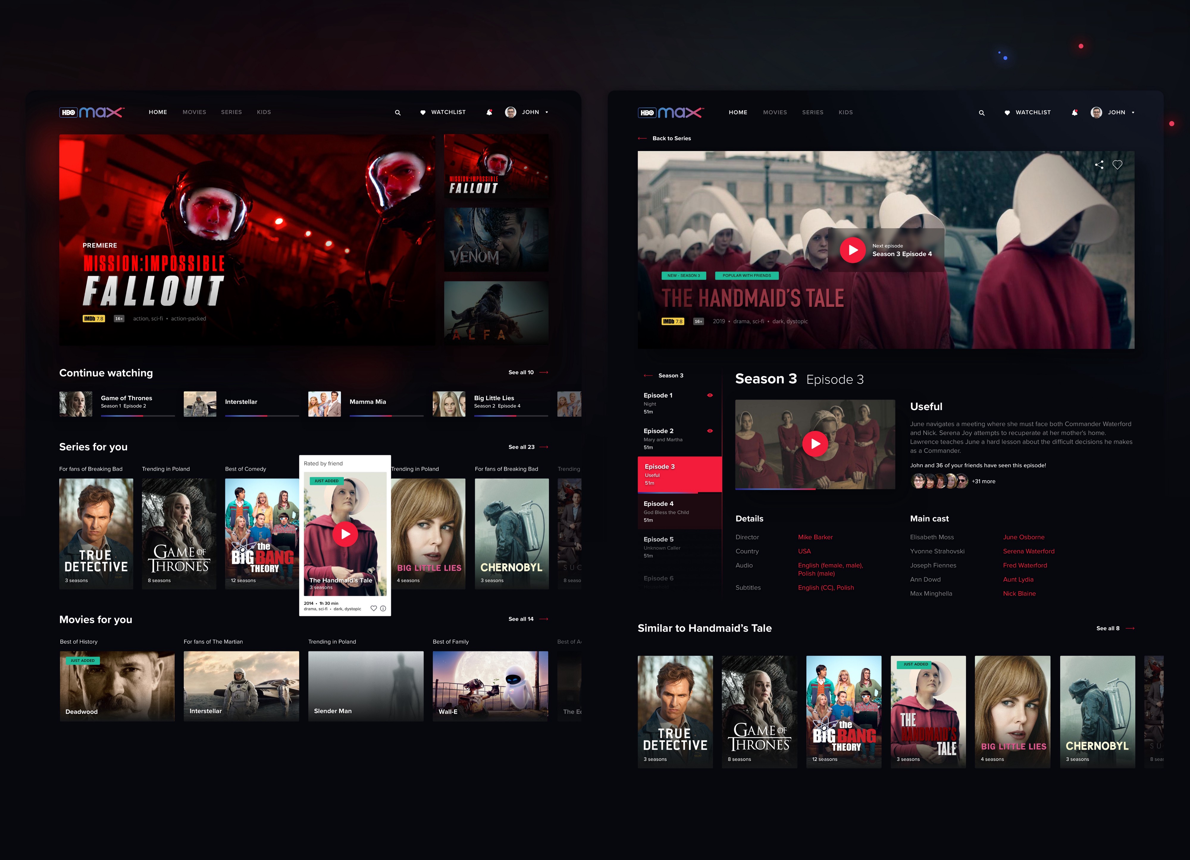
Continue watching is the core task for the HBO GO users. Technical sync problems aside, the “Continue” section was difficult to differentiate from the rest of the page. We decided to make the tiles stand out and place them so they appear above the fold on a majority of computer screens. We have also made it easier to play the next episode straight from the series page.
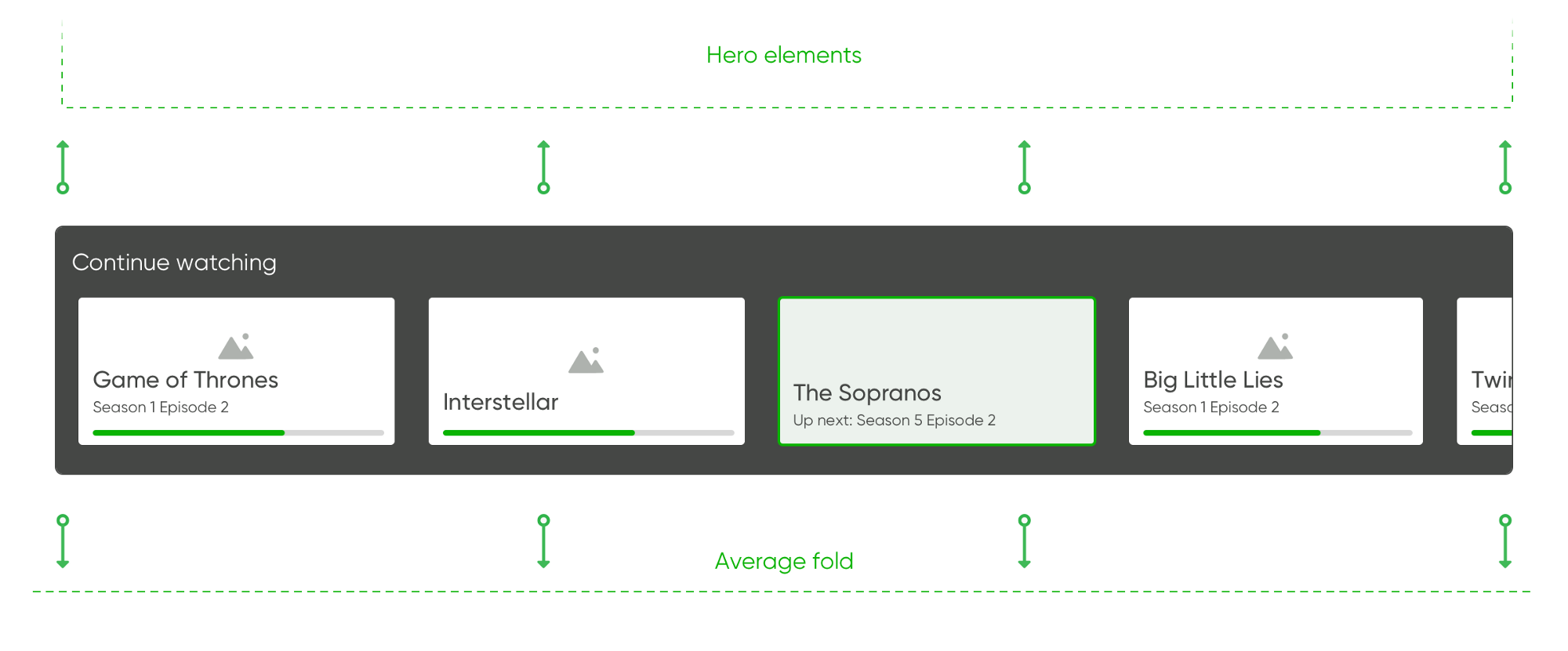 “Continue watching” would need to be accessible primarily from the above-the-fold section of the dashboard.
 When users click through to a particular series they’ve been watching, “Continue watching” should be the first action they see.
I want “My List” to be at hand
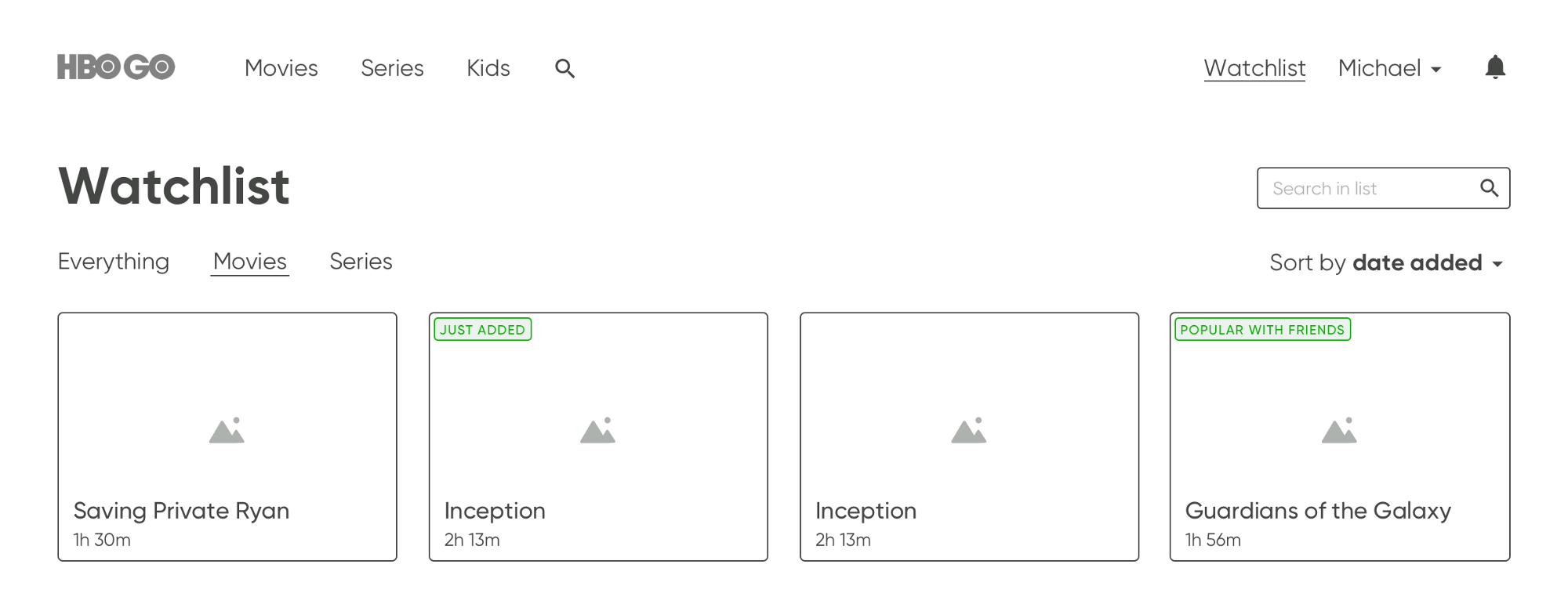
Even though the “My List” feature is very popular in streaming services, currently it is almost impossible to find in HBO GO, while the platform is pushing generic content to the users.
We decided to make this functionality easily accessible from the main navigation and split into series and movies. As I mentioned earlier, we discovered that watching series and movies are two completely different use cases, so we decided to split it into Movies and Series tabs.
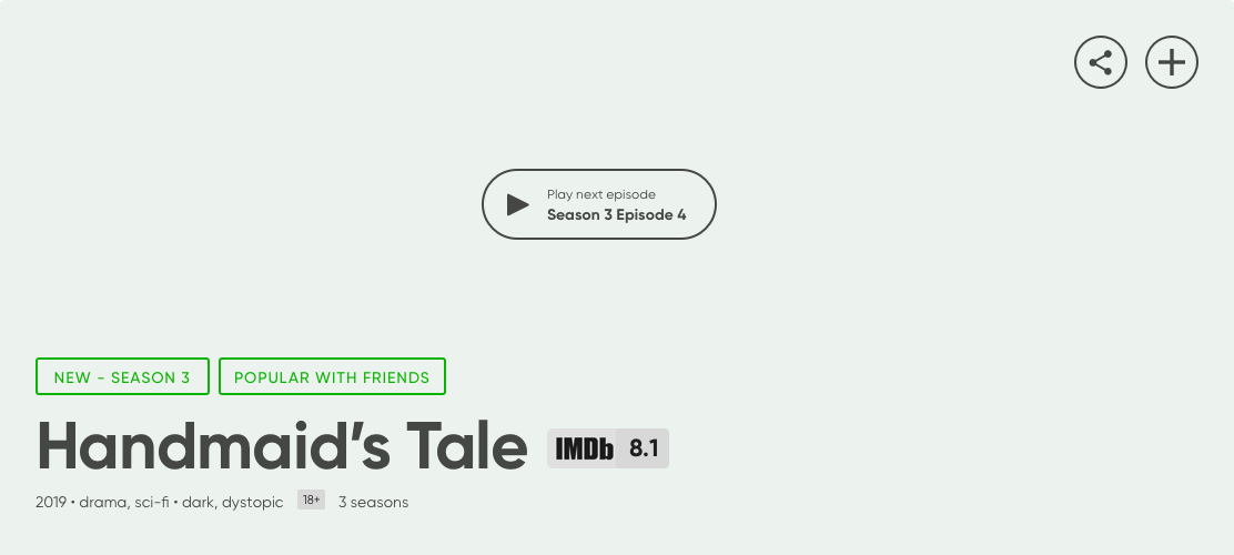
Content discovery needs help
Due to the confusion it caused, we decided the content tiles should be different for series and movies, as watching each of them was an entirely different use case for the user.
 Our usability testing respondents had substantial problems to find interesting movies or series.
We also felt that the homepage did not allow enough interaction on the tiles, and that’s why we introduced hover previews and an “Add to my list” button.
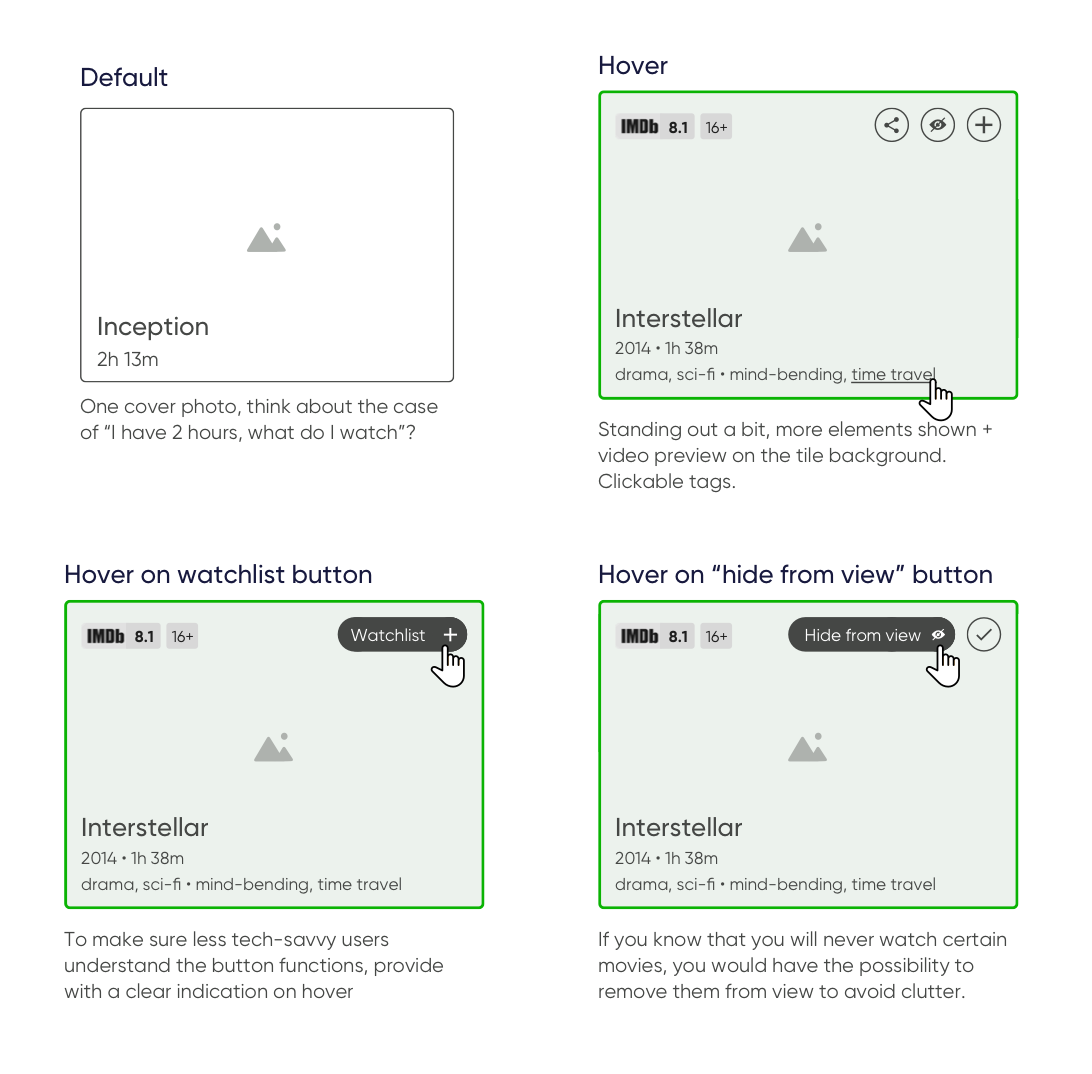 All microinteractions needed to be carefully crafted for the maximum usability and compact layout.
UI Design
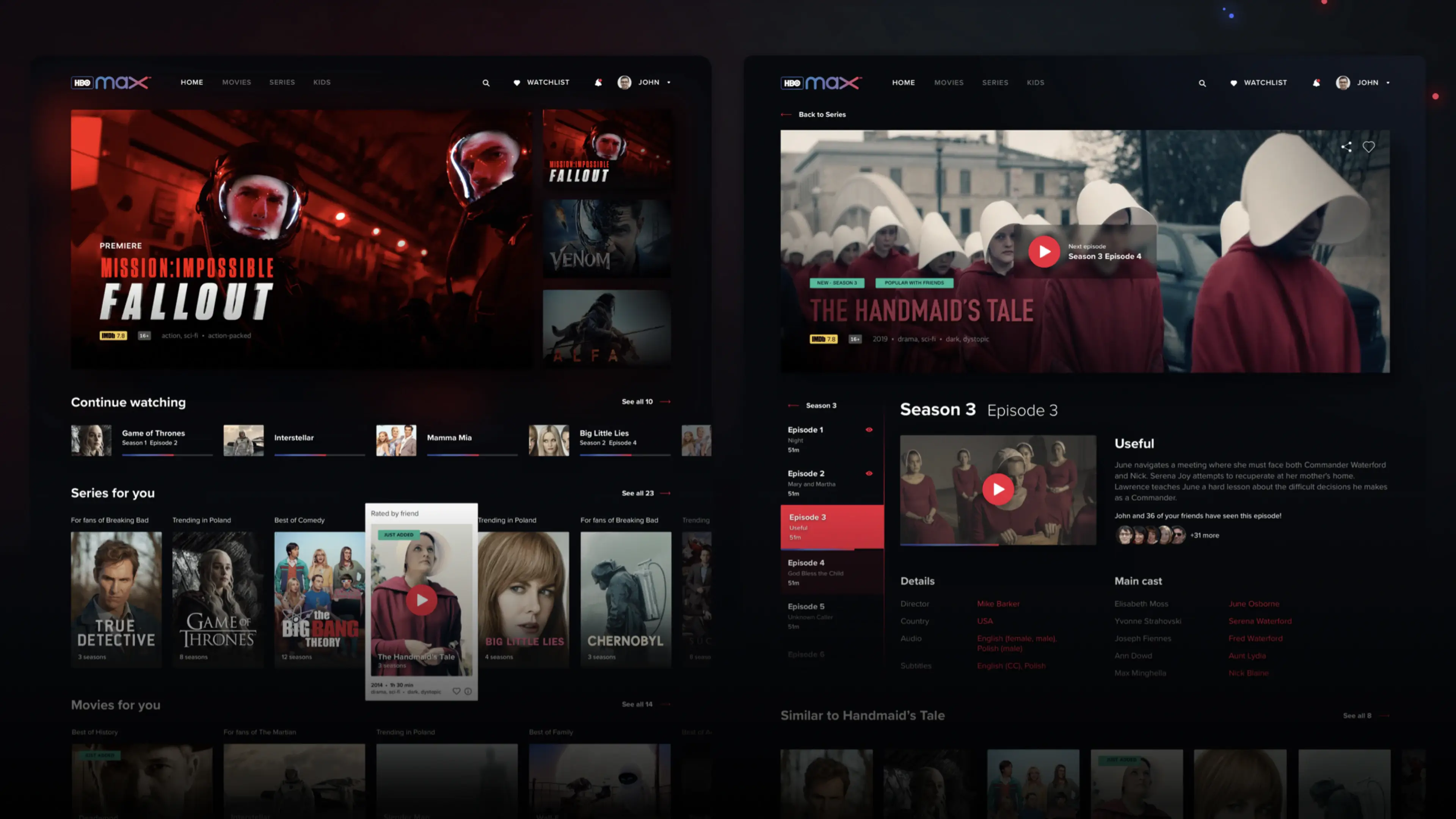
When working on the visual design we wanted to give it a distinct personality and a strong brand image separate from HBO’s prior Video on Demand ventures HBO GO and HBO NOW.
The Dark UI design was used to provide a cinema-like experience. But it was equally important to present HBO’s diverse and big database clearly and give users’ the easiest access.
The use of rich contrast among active elements was desired to keep users in touch of what they can do and where they are now.
 EL Passion’s UI design concept of the HBO VOD platform.
Making it interactive
Interactions are an important part of user experience, that’s why we focused on making them not only pretty to look at, but also on making them increase the product’s usability.
Rich hovers
When hovering over a poster block, the user gets access to new additional information about it: the amount of seasons, its length or what genre it is. That way we are separating details from other visible elements so that the screen doesn’t get cluttered with information that divides users’ attention.
Transitions
We wanted to make the transitions as fluid and as seamless as possible. That way there is no disconnect when going between separate pages while using the service. Every single one of them feels like a part of a bigger whole.
The companion app
As an addition to the web-based service we also designed a companion app providing users with a couple of features to augment the basic browsing and watching experience:
- Remote control of the web app
- Easy browsing for adding to the Watchlist
- Live insight into the episode and the scene you’re currently watching.
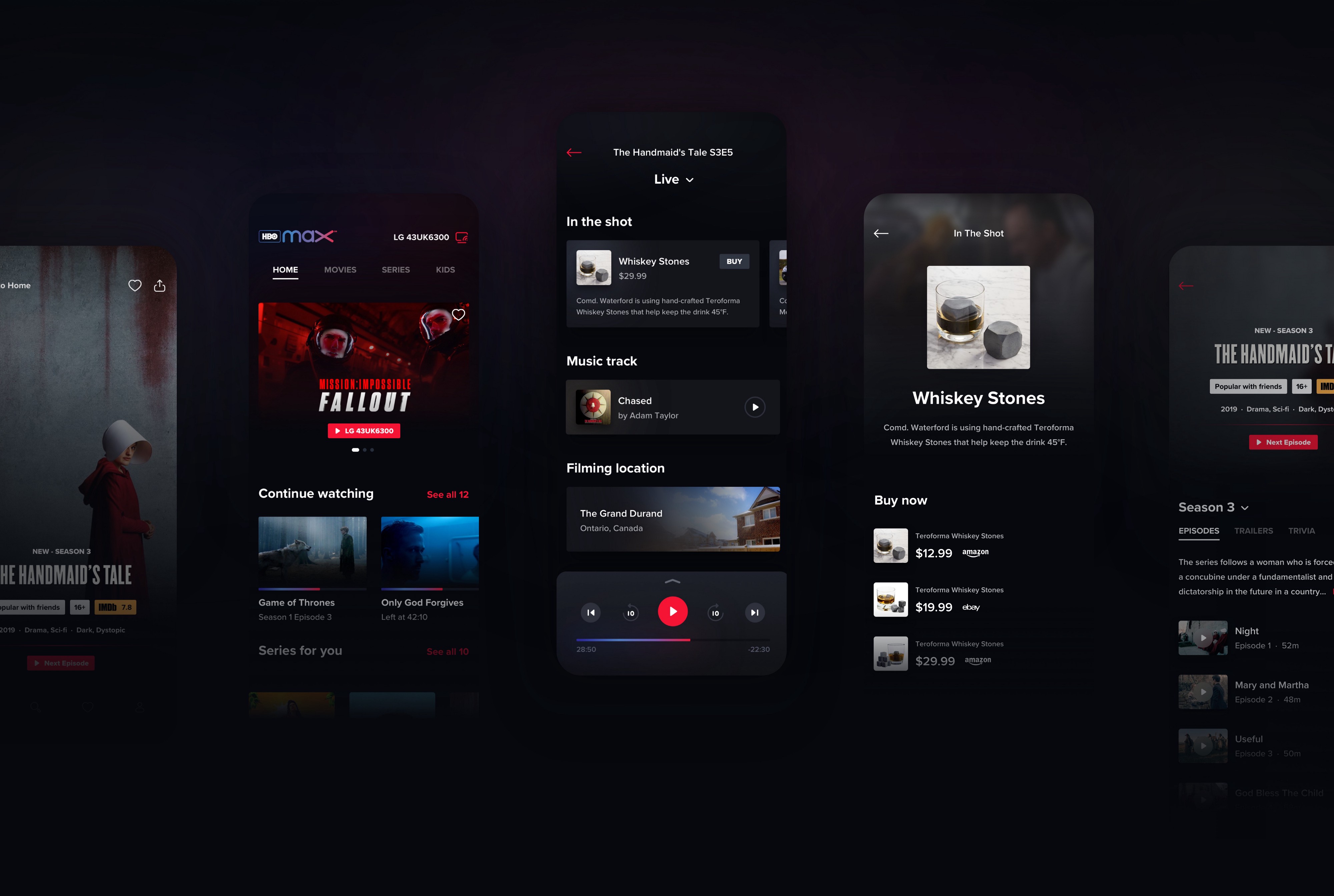
Augmenting the watching experience
Showcasing additional information related to the ongoing scene is the key feature of the companion app. Displayed info can include on-screen products being used, currently performing actors and actresses or the filming location. All this information can be interacted with to provide more details or, like in the case of physical goods, users can go straight to the online store and buy them.
The final effect of HBO VOD redesign
Our amazing UI designers put together this beautiful animation that showcases the final effect of the work of the whole team:
- UX Strategy & UX Design — Michał Mazur, Mateusz Przegiętka
- UI Design & Animation — Arkadiusz Borysiuk, Wojciech Dziedzic
Be sure to check out our Behance case study as well.
Do you need help scoping your product?
We're available for new projects!
We’re available for new projects.

Before you go...
you can explore blog post that we recommended for you 👇🏻